Butler University issued the following announcement on April 22.
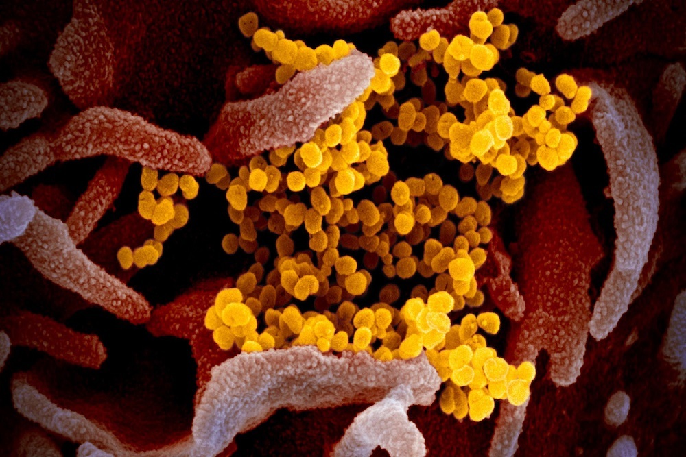
You’ve probably seen the images flooding the news of floating spheres covered in spikes—an up-close view of the microscopic 2019-nCoV particles that cause COVID-19 and have changed our lives in so many ways over the past two months. The depictions provide a concrete visual for something otherwise so abstract to most people. There are many things we still don’t know about the novel coronavirus, but at least we know roughly what it looks like.
That’s all thanks to a team of artists at the National Institute of Allergy and Infectious Diseases (NIAID)—part of the National Institutes of Health (NIH)—where Austin Athman ’09 works as a Visual Information Specialist.
At Rocky Mountain Laboratories in Hamilton, Montana, science and art collide. After high-power microscopes capture black-and-white images of disease samples, Athman and his colleagues in the Visual and Medical Arts Unit use digital tools to add colors and details that bring the photos to life.
The end result is a colorized image that helps scientists better understand the virus particles—which are about 10,000 times smaller than the diameter of a human hair—as well as put a face to a top enemy for the general public.
When COVID-19 arrived in the United States, Athman’s lab received a sample of the coronavirus from one of the first patients.
“As soon as we had the sample,” Athman says, “we started taking pictures, colorizing them in Photoshop, and putting them on the NIAID Flickr website. The next day, we already saw the images being used by major news outlets across the country.”
Now, Athman has completed more than 15 different colorizations of COVID-19 images, along with a 3D model that can be printed and studied. Beyond providing compelling visuals for news stories, adding color helps scientists communicate their research.
Athman starts by sitting down with scientists and microscopists to learn more about what he’s looking at in the black-and-white photo. His colorized images are usually meant to accompany research publications, highlighting the features scientists are referring to in the text.
“If I can get a scientist to sit down and explain what something looks like in common language,” Athman says, “it helps people outside the lab understand something about science in a way words can’t always do.”
Athman wants viewers to look at the most important part of the image, and that’s where art comes in. Using photo editing software, he starts by adding highlights and shadows that bring depth to the otherwise flat-looking photos. He also rotates and crops the images in a way that guides the eye to desired focal points.
Then comes the color. The scientists and artists don’t know what the particles’ true colors are, or if the diseases even have color. But they choose palettes that make the photos more engaging and understandable while still appearing realistic.
While Athman has always enjoyed science, he says he doesn’t actually have much formal experience in the field. At Butler University, his degrees were in Music and Multimedia Studies. But he grew up near his current lab and first got involved with the NIAID when, back in high school, he applied for an internship that would let him explore his interest in graphic design. He started the internship as a high school junior, then returned each summer to work full time. When he graduated from Butler in 2009, he accepted a permanent position and has been at the lab ever since.
“Recently, I’ve been focusing on the COVID-19 images,” he says about his day-to-day work. “But when we aren’t in pandemic mode, I do all kinds of visual things. I draw illustrations, design graphs, edit videos, and create scientific animations.”
With the COVID-19 colorizations, Athman says it has felt strange to see his work all over the news so suddenly. But it’s not the first time his art has been on a national stage. Until now, a colorization of HIV particles was his most popular image, appearing for years on almost any article related to HIV. Several of his colorizations are also featured in a Smithsonian exhibit called Outbreak: Epidemics in a Connected World, currently open at the National Museum of Natural History and available digitally here. One of his Bubonic Plague colorizations was published in a 2013 issue of National Geographic—fulfilling one of Athman’s childhood dreams.
“It’s a new thing almost every day,” he says. “You never get bored. And this merge of art and science—I think a lot of people aren’t really aware this kind of field exists.”
Original source can be found here.

